Logo Initialien
This logo was designed to reflect the identity and vision of the website through a clean, elegant, and thoughtfully crafted visual style. The goal of the design was to create a logo that feels both refined and memorable while
capturing the overall atmosphere of the website.
The concept is based on my initials, “S” and “P.” The letter S was creatively designed in the silhouette of a swan. The swan was chosen as the central element because it
symbolizes elegance, grace, and a subtle sense of
romance, which perfectly reflects the theme and
aesthetic of the website.
The color scheme was carefully selected to complement the overall design of the website. For the swan-shaped “S,” I chose a soft pink tone to highlight elegance and warmth. The “P” is presented in green to create a gentle contrast while maintaining a harmonious and balanced appearance. Together, these colors work beautifully and give the logo a distinctive and visually pleasing character.
Overall, the design combines symbolism, color harmony, and simplicity to create a logo that represents the
website’s identity while leaving a lasting and elegant
impression.
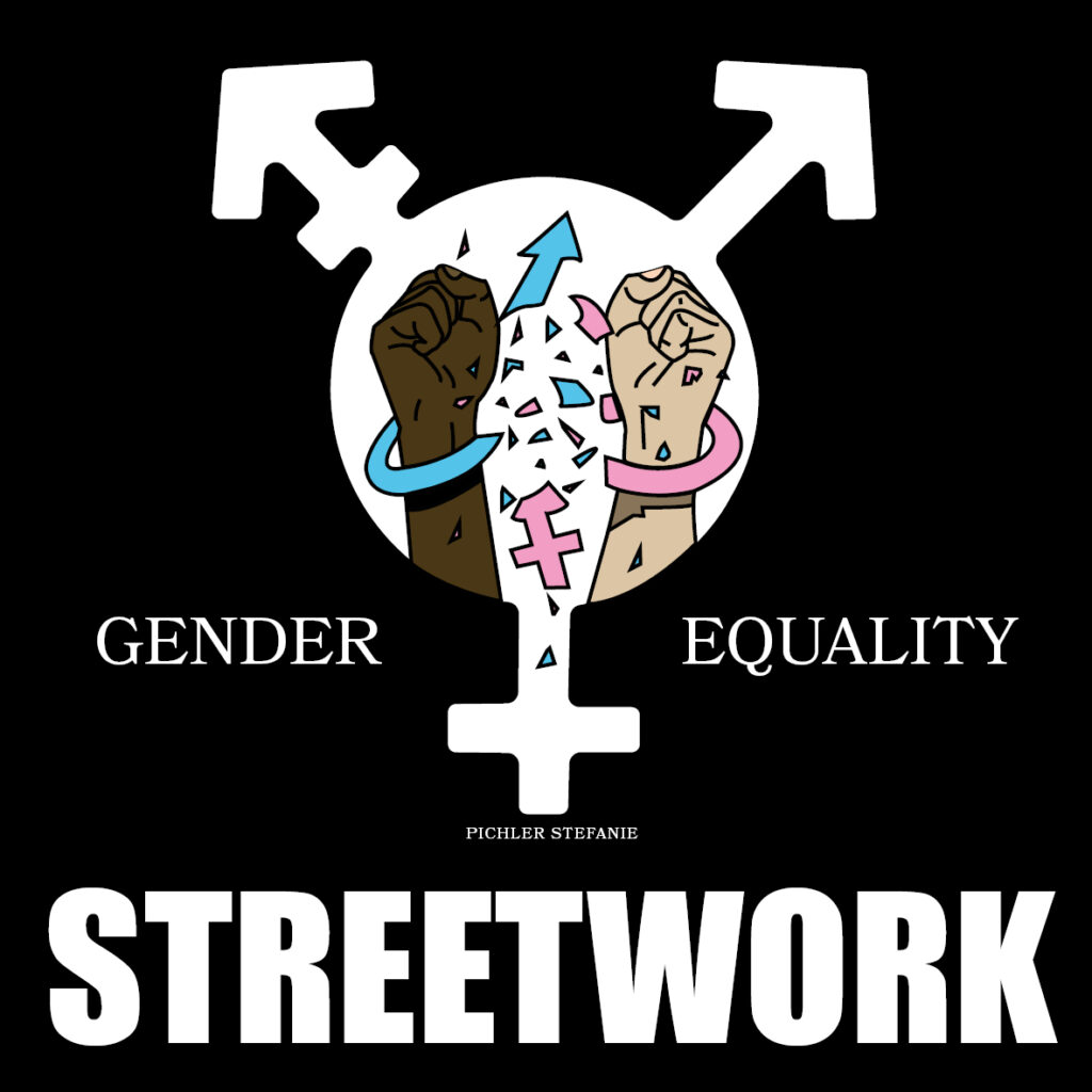
Streetworker Sticker
This sticker design was created to visually communicate a strong message of inclusivity, empowerment, and social awareness through a bold and impactful graphic style. The aim of the design was to produce a sticker that is not only eye-catching but also meaningful, leaving a lasting impression while clearly reflecting the values it represents.
The concept centers around the theme of gender equality. At the heart of the design is a combined gender symbol, which unifies different gender identities into a single, powerful visual form. Inside this symbol, two raised fists are illustrated—each differing in skin tone—representing solidarity, diversity, and the ongoing fight for equal rights across all communities. This imagery conveys strength, resistance, and unity.
The surrounding elements further reinforce the message. The arrows extending from the central symbol highlight inclusivity beyond traditional gender definitions, while the text “Gender Equality” clearly states the core idea behind the design. The bold “Streetwork” typography at the bottom gives the sticker an urban, activist-inspired aesthetic, connecting it to grassroots movements and public advocacy.
The color palette was carefully chosen to enhance both contrast and symbolism. The dark background ensures the central elements stand out strongly, while the use of varied skin tones emphasizes diversity. Subtle accent colors, such as blue and pink, reference gender identity while being integrated in a modern and balanced way.
Overall, the design combines symbolism, contrast, and strong visual elements to create a sticker that is both expressive and purposeful. It captures the spirit of equality and activism while maintaining a striking and memorable appearance.
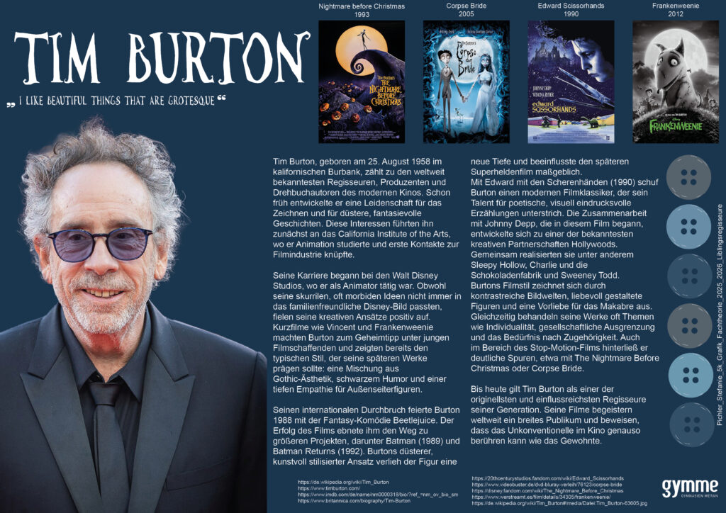
Lieblingsregisseure
This project was created to present my favorite director in a creative and visually fitting way. For this work, I chose Tim Burton and designed a DIN A3 page inspired by his unique style and atmosphere.
For the title and subtitle, I used the “Tim Burton Font” to match his iconic aesthetic. Next to the title, I included four of his most famous movies. The information text was written in the font “Bahnschrift” and placed slightly to the right to create a balanced layout.
On the side of the page, I designed illustrated buttons because buttons are an important object in many of his films. As the background color, I chose a dark blue-grey tone, which I felt perfectly reflects his mysterious and dark artistic style.
Overall, the design combines typography, illustration, and color to capture the unique atmosphere of Tim Burton’s work.